My initial impressions of the Gutenberg editor were not very favorable. I’ve only installed WordPress 5.0 on one website thus far. My own niche website. I wrote two blog posts on that site with the new editor before pulling the plug and installing the Classic Editor plugin.
I tried.. I mean, really tried to give Gutenberg a chance. It’s not for me. It’s one of those cases where people either love it or hate it. From my observations, the hate it camp far outweighs those who love it. There’s a certain correlation between WordPress newcomers and those who have worked within the platform for years when it comes to the opinon of Gutenberg. Can you guess where each group stands?
As a veteran WordPress user, I always force myself to explore new methods of design trends. The last thing I want to be is one of those people with such blind loyalty to the current standards that I don’t give a chance to new things. It’s good to have options and competition. I realize this is the case with Gutenberg.
The WordPress team needed a core product that could go toe-to-toe with premium page builders. In its current development, however, Gutenberg is in a much lighter weight class than these other established page builders. The only audience it seems to appeal to are new WordPress designers and developers who have yet to experience other page builders.
So what are the major issues I have with Gutenberg? Read below and you’ll see that it isn’t nitpicking on my part.
Issue #1: It’s Counterproductive
Gutenberg lives up to the description of a block-based editor. Type in words, hit the enter key, and you’re seamlessly taken to a new section/block. Blocks can also contain images, tables, lists, and other data. It all sounds great on paper, but in reality, the process isn’t quite as smooth.
For instance, more often than not I’m editing blocks via HTML. This means that in each block I need to click on its settings and select Edit as HTML. Contrast this with the classic editor’s text mode where only one click is needed to toggle over once for HTML editing in a post or a page. This brings me to another point.
Speed and Efficiency
When working with the premium page builder WPBakery, I’ve grown accustomed to that builder only being applied to pages. Posts were written using the default WordPress editor. Of course, shortcodes can be used in posts but since the main purpose of using posts over pages is to blog, speed is key.
When writing two blog posts for my niche website earlier this week, it took much longer than it should have. I like to assign different classes to various objects which means editing in HTML mode. Even when my coding is perfect, WordPress will complain that the block needs to be resolved. Many times the resolved code looks identical to the original code.
Issue #2: Compatability Problems
I’ve read how some Gutenberg users have problems with certain notable plugins or extensions and how they function with one another. I haven’t used the new editor long enough to discover too many problems such as this. However, one, in particular, was a major deal-breaker.
Grammarly Isn’t Functioning Correctly
I rely on Grammarly for proper spelling and punctuation when blogging. It’s definitely not perfect (neither are my posts), but it has been a huge help. For whatever reason, random problems occur with Grammarly when using the blocks.
One such problem is that highlighted words will not have any suggestions when clicked on. I’m not sure if this is an isolated incident for my site only. Perhaps there are conflicts with other plugins creating the issue. However, there is a much more serious problem.
I noticed that HTML code like div containers associated with Grammarly were actually being inserted into the HTML editor of Gutenberg! The last post I wrote had over twenty instances of this code. I had to manually go in and remove it before publishing.
Issue #3: Editor Sidebar Too Cluttered

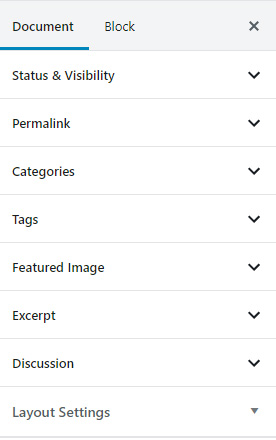
Gutenberg Editor Sidebar
In the classic editor, the sidebar contains sections for publishing, categories, formatting, and more settings. Gutenberg complicates things by adding tabs to the sidebar. One on the document level and the other for blocks. All of the sections are collapsed by default which necessitates more clicking. Personally, I preferred scrolling down the sidebar to make changes.
Custom Section Formatting Problems
The go-to theme that I frequently use has a custom section in the editor sidebar. It formats just fine in the classic editor but is a jumbled mess in Gutenberg. Is this a problem that theme developers are going to need to account for? Do separate CSS formats need to be created for both editors? I don’t think that responsibility should fall on their shoulders.
What Issues Have You Experienced?
I’m curious what problems other people have encountered. Feel free to comment below and let me know. Even if you have positive feedback about Gutenberg! I do think there is room for improvement. Maybe some hybrid version of the classic editor and Gutenberg will please both veteran and new WordPress users alike. Although, I don’t see anything like that happening for quite some time.


